Swedavia Airports
A website redesign
Background
Swedavia owns, operates and develops Sweden’s national basic infrastructure of airports. These ten airports form a system that connects Sweden together – and connects Sweden with the rest of the world.
Purpose
This is a fictive project.
For this project I wanted to focus a bit more on the visual elements and also create consistency in terms of findability and clear UI elements. Both UI elements and design elements needed to be worked on for this little project.
The current & the new design

Landing page - I wanted to avoid the two-click step from the beginning. There will be less time consuming to select airport once you have all of them available on the same page.
Current landing page
Redesign of the landing page

1:2 Current destination page
1:2 Redesign of the destination page
Destination page - The shortcuts and the time table for the security checkpoint is much more in focus when positioned on cards. This new interface is simply presented and provides the user with at-a-glance information.
2:2 Current destination page / Slider
2:2 Redesign of the destination page / Slider
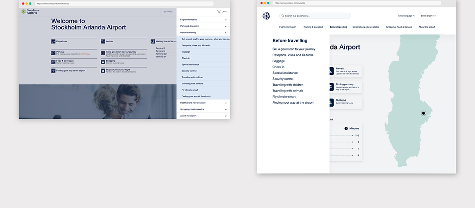
Destination page / Slider - When hovering or clicking on the main category, a slider will push out from the left side of the screen.
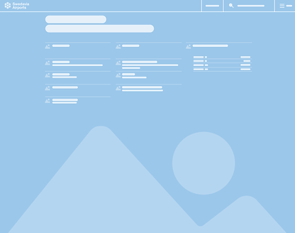
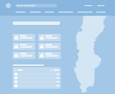
Layout
Current layout
New layout

-
The search bar was quite hidden before, positioned to the right side of the screen. It’s now left aligned and more visible in the new design.
-
“Select language” and Select Airports”.
-
The hamburger menu was placed far to the right which was a bit hidden. The main categories from the hamburger menu is now displayed below the search bar. It’s more recognizable and easy to reach.
-
I enhanced the visibility of the shortcuts by using a slightly bigger and clear icons on clickable cards.
-
The time table for the security checkpoint is - like the Shortcut elements - placed on a clickable card. The purpose of using cards here is to provide a much more satisfying user experience. They feel more clickable and the user interface is more communicative than before.
UI guidelines

The original color scheme contains multiple colors. But for this redesign I decided to stick to two colors. Trafikblå (Traffic blue) and Mintgrön (Mint green).
New icons for this redesign. The icons are flat and solid, placed on a colored surface with rounded corners (radius 10)
Typeface: Helvetica Neu.Style: Light, Regular, Medium.